Reopening a 1998 business application to the people who had given up on it.
A full redesign of the query tool used by Renault's supply chain, built to fit inside the existing systems with no additional back-end development.
- 1998
- the year the application was launched, and it was still in service at the time of the redesign
- Unaided
- the stop criterion: the people who avoided the tool ran a complex query on their own
- Built
- the application was developed in line with the design, then deployed
The context
Renault’s supply chain teams need to query the vehicle fleet constantly: managing stock, tracking production and delivery, spotting maintenance or recall needs. A typical query looks like this: every vehicle of a given model, in a given body colour, with or without a given interior trim, bound for one country, between two dates.
They did this in Pilotage Web, an application launched in 1998 and still in service. Over the years it had become so hard to handle that productivity suffered. The work happened across a mosaic of small overlapping windows, inherited from the interfaces of its time.
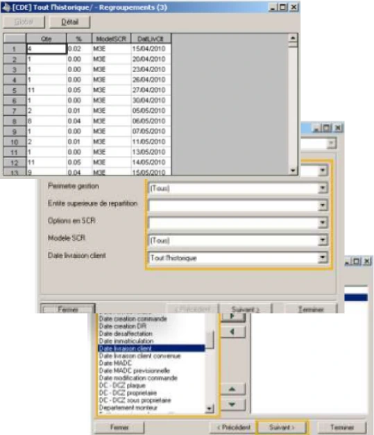
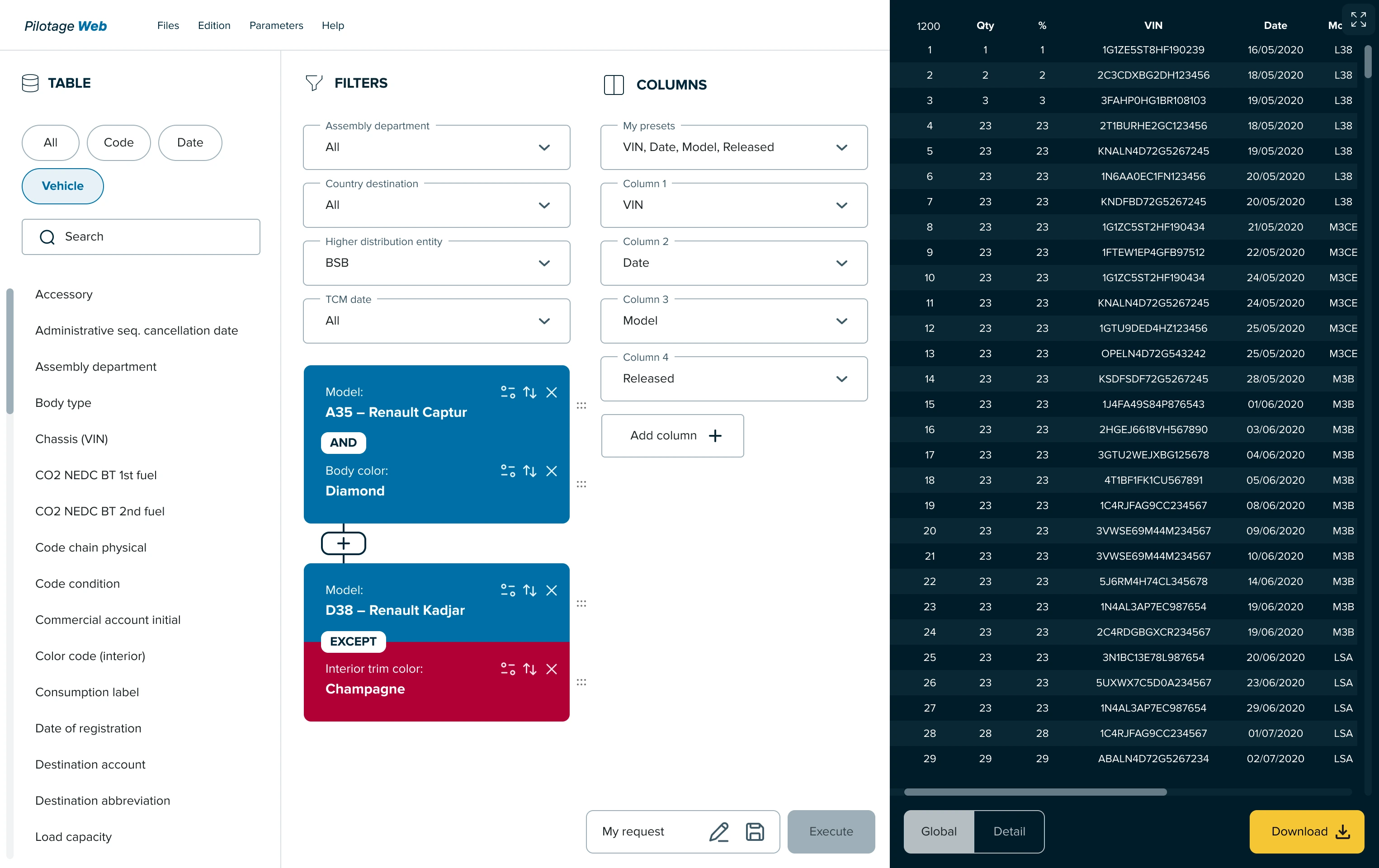
The goal fit in one sentence: redesign the application to improve its adoption and the productivity of the people using it. With three constraints. Users whose needs and levels of expertise were far apart. A short timeline. And above all, a design that had to fit inside the existing systems with no additional back-end development: I could reorganise access to the data, not the data.
Two profiles, one tool
Before interviewing anyone, I learned to use the tool myself.
The immersion phase was not a formality. After hands-on training, I could build a complex query. Without that, I could not have watched a user work and understood what was blocking them, nor held an equal conversation with people who do this every day.
Six one-to-one interviews, in person, in two parts each. First, questions about their profile, their experience of the tool, their needs and their difficulties. Then a complete query to run on the application, thought aloud, which I walked back through step by step to collect what a direct question never surfaces.
Two profiles stood out clearly, and that result shaped the whole design.
The beginner feels lost, and delegates
“I feel lost among all these windows and options.” They struggle with simple queries, ask for help as soon as it gets harder, and end up avoiding the tool by handing their queries to a colleague.
The expert manages, and pays for everyone
“I'm used to this interface, but it is still frustrating.” They can do anything, and spend part of their days training and rescuing others. The bottleneck was not only the tool, it was the handful of people who could operate it.
I reported this research as empathy maps rather than personas. With six interviews and a short timeline, they showed the findings gathered without claiming to describe the whole population. They can be read in a minute and remained the basis for the design.
The decisions that made the redesign
Three structural decisions, taken to answer what the interviews had shown.
A query reads left to right, on a single screen
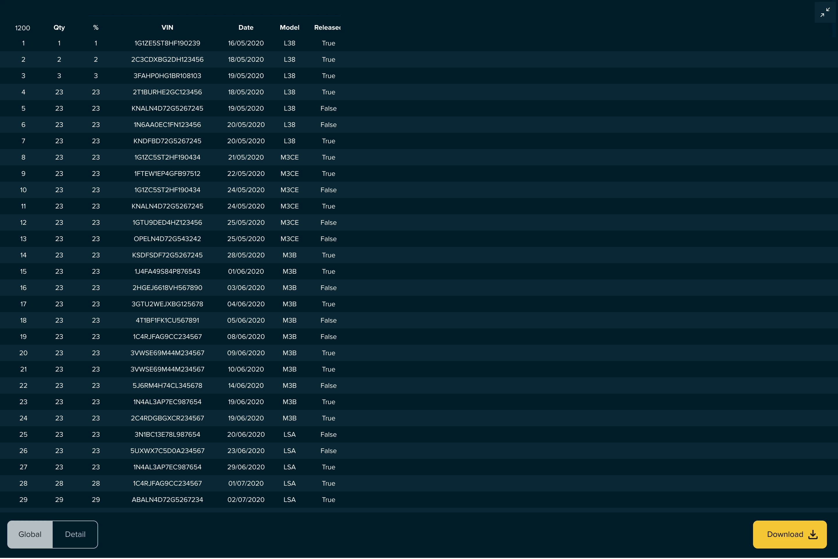
I first identified the four real steps of building a query, then laid the page out in that chronological order. No more overlapping windows: the query stays fixed on the left, the results table takes the right and adjusts to the screen, with a full-screen mode for when the data has to be read.
Logical conditions become objects you can handle
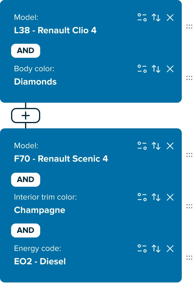
This is where users failed. Inclusion, exclusion and addition were abstract concepts buried in menus. They become visual blocks, stacked and linked, assembled by hand. The same list of criteria then produces different queries depending on how they are combined, and that difference is visible.
A UI kit built from scratch, minimal, on two backgrounds
The interface looked dated, which weighed most on beginners. I created the identity and the components, and split the screen into two registers: query building on white, results on dark. Two backgrounds, two activities: you always know which side you are working on.
Data selection
- Choice of the table to query
- Search across available fields
Filtering and conditions
- Filters across the whole query
- Inclusion, exclusion, addition
- Optional
Column setup
- Choice of columns to extract
- Reusable presets
Result
- Reading the table
- Full-screen view
- Export
Testing, sign-off and follow-through
From the first wireframes onward, I ran fast, iterative tests on an interactive prototype: a query to run, feedback, a fix, another test. The stopping rule was not my opinion of the mockups, it was the beginner. I finalised the redesign when the different profiles, including those who avoided the tool, could run the query without help.
The concept was then presented to the management and development teams, who approved it, and handed to the developers for implementation.
I did not stop at the handover. Already embedded in my next engagement at Renault Digital, I kept working half-time for two months on Pilotage Web, following development with the developers and the Product Owner, making sure the implementation stayed faithful to the design. At the end of those two months, the application had been built in line with the design, then deployed.
What I take from it
The problem was not that the application was ugly or old. It was that it had created a dependency: a handful of experts carried the queries of a whole department, and everyone else had given up. A redesign that only modernised the surface would have changed none of that.
What solved it was making visible the logical operations the old interface asked people to imagine. The beginner did not have to learn inclusion and exclusion: they saw them, and moved them.
It is also the engagement where I started staying past the handover of the mockups. Two months half-time next to the developers, years before my first React prototypes. On this engagement, that follow-through helped verify that implementation stayed faithful to the design.